
COMPETITION : New ScoobyNet Logo
 05 November 2006, 08:17 AM
#1

OK, we're about to reach a momentous date in ScoobyNet history.
In line with recent requests, its time for a bit of a spruce up!! We've had the scoobynet logo since day dot, and whilst we're very attached to it, it wouldn't hurt to update it a bit!
We have some incredible talent on ScoobyNet (and I'm not just talking about the hot totty! ) so rather than turning over the design to some annonymous agency, we decided to see what you lot could come up with!
There are two categories to the logo design.
Category one :
A completely new logo. Go wild and creative. This doesn't need to be in line with the current brand scheme, or colours, or anything.. there are pretty much no restrictions (although see below for guidelines)
Category two :
Update the current logo. In this category, we're looking for a new and updated logo, but one which clearly has roots in the current logo. Someone who knew the current logo well, will instantly recognise it as an updated version.
Ideally, category two would be used, but we will consider category one as well.
Guidelins :
The logo needs to be practical. Consider things such as the size and shape, not something too wide or too tall that it becomes tiny if you want to fit it onto a small part of the screen. Try to keep colours solid and bold, so it will work well on print as well as on the website.
The logo needs to be bold and striking. Intricate details tend not to work as well, and get lost if the logo is reduced in size, etc.
The logo needs to be able to be used on different background colours. We take care of this with the current logo by using white in place of the black parts, and vice versa.
--
So..
Submit your designs to this thread, or by PM if you prefer..
We'll then select some of our favourites and if we're struggling to decide, we'll put them to a vote. The winner(s) will recieve lifetime ScoobyNet Plus membership (subject to standard ScoobyNet Plus T&Cs) and some scoobynet branded goodies with - you guessed it - the NEW logo on them!!
Good luck!
Simon and Shaun
In line with recent requests, its time for a bit of a spruce up!! We've had the scoobynet logo since day dot, and whilst we're very attached to it, it wouldn't hurt to update it a bit!
We have some incredible talent on ScoobyNet (and I'm not just talking about the hot totty!
) so rather than turning over the design to some annonymous agency, we decided to see what you lot could come up with!There are two categories to the logo design.
Category one :
A completely new logo. Go wild and creative. This doesn't need to be in line with the current brand scheme, or colours, or anything.. there are pretty much no restrictions (although see below for guidelines)
Category two :
Update the current logo. In this category, we're looking for a new and updated logo, but one which clearly has roots in the current logo. Someone who knew the current logo well, will instantly recognise it as an updated version.
Ideally, category two would be used, but we will consider category one as well.
Guidelins :
The logo needs to be practical. Consider things such as the size and shape, not something too wide or too tall that it becomes tiny if you want to fit it onto a small part of the screen. Try to keep colours solid and bold, so it will work well on print as well as on the website.
The logo needs to be bold and striking. Intricate details tend not to work as well, and get lost if the logo is reduced in size, etc.
The logo needs to be able to be used on different background colours. We take care of this with the current logo by using white in place of the black parts, and vice versa.
--
So..
Submit your designs to this thread, or by PM if you prefer..
We'll then select some of our favourites and if we're struggling to decide, we'll put them to a vote. The winner(s) will recieve lifetime ScoobyNet Plus membership (subject to standard ScoobyNet Plus T&Cs) and some scoobynet branded goodies with - you guessed it - the NEW logo on them!!
Good luck!
Simon and Shaun


Trending Topics
06 November 2006, 06:19 PM
#9
Scooby Regular
iTrader: (5)

Join Date: Jan 2004
Location: Bedfordshire
Posts: 8,948
Likes: 0
Received 0 Likes
on
0 Posts
Iv'e got a few designs done already. Just working on a few more 
Will post them up later.
Darren
Will post them up later.
Darren
Originally Posted by webmaster
We'll set an initial closing date of this friday, and will review it based on the entries we've had then.


 06 November 2006, 09:32 PM
#14
Scooby Regular
iTrader: (5)
Join Date: Jan 2004
Location: Bedfordshire
Posts: 8,948
Likes: 0
Received 0 Likes
on
0 Posts
Jon, thats not a bad idea, although scoobynet has been around for quite a while with lots of members. Maybe a change in name might be a good idea to get away from, shall we say 'bad press' that has occoured during SN's time on line. But hay thats live and forums. Scoobynet is known pretty much over most of the world and to change the name now to something other than Scoobynet would be a total disaster...people would be saying, why was scoobynet thought up is if it was not to 'hang-around' for a while?
What I think is really needed is a 100% spruse up bringing the site bang up to date, so its in the 21st Century and not the late 90's. A new logo is one way, but it needs to match the rest of the site if it is to stand anychance of being a brilliant site made into an fantastic site. (Something like that anyway).
Darren
 07 November 2006, 12:53 AM
#16
Scooby Regular
Join Date: Oct 2004
Location: There is only one God - Elvis!
Posts: 8,328
Likes: 0
Received 0 Likes
on
0 Posts
07 November 2006, 01:40 AM
#17
Scooby Regular

Join Date: Jan 2004
Location: Being hunted down and killed one by one
Posts: 10,235
Likes: 0
Received 0 Likes
on
0 Posts
Well this makes a change, a competition that you don't need to be a plus member to enter 
I'll get the team of designers on it first this in the morning
I'll get the team of designers on it first this in the morning
07 November 2006, 10:07 AM
#18
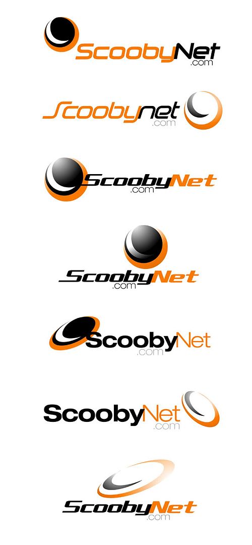
Nice work Darren!
Thanks for putting in the time you've obviously spent on them!
I don't think it would be right (or legal I suspect) to use the Subaru logo as part of the new ScoobyNet logo. But I like the direction you're going in. What do you think to incorporating something that shows its a community, like a speech bubble or similar? Thanks again!
Thanks also to isubaru. Great looking logo, but it would make the wording very small if you wanted to fit it on to a small area of the screen, and the faded, non-solid colour make it more difficult to use for print. It looks seriously cool though!
Keep them coming guys, I feel more confident now that we're doing the right thing!
07 November 2006, 12:28 PM
#22
\m/ ^_^ \m/

is it an eclipsed moon?  and is the sun meant to be eclipsed too?
edit: think i got it
and is the sun meant to be eclipsed too? edit: think i got it
Last edited by flat4; 07 November 2006 at 12:52 PM.


 07 November 2006, 03:34 PM
#30
Scooby Regular

Join Date: Jun 2006
Posts: 214
Likes: 0
Received 0 Likes
on
0 Posts
I think it might be a decent gesture, if you included some kind of tribute to Richard Burns, If Subaru wont pay a new tribute to him, perhaps we could?
perhaps the above, but with his winning dates, d,o,b, etc etc
perhaps the above, but with his winning dates, d,o,b, etc etc