
ScoobyNet - New Layout


")
 He did say he'd done them ALL

*serious mode again*
I'm still trying to adjust to the new format. I can say I appreciate the time and effort that goes into the site, and I like the little scoobie cars we can now have. I also like the mode buttons, they are cool, saves a lot of time to fiddle with screen setup that most people would not have known could be altered.
Only 2 points I have:
1) I know you made positive changes to the top half of our screens, but I still think too much screen real estate is taken up before you get to read threads. I'm trying to think of a way to combine the existing menus so that they exist together, and therefore take up less space (you know the home, forum, scoobnews area and the user cp faq calendar etc i think should be all next to one another) Maybe the scoobynews menu could be brought down into the user cp menu. That would free the top right of the screen to move the current banner ad up into that area? That could reduce the height needed for menus by an inch or so.
Maybe I will manage to muster up a really horrid photoshop (my skills are BAD) to explain things better.
2) Banner ad on right, same issue as before and mentioned by others so I won't repeat.
Scooby Regular
Joined: Dec 2002
Posts: 9,277
Likes: 0
From: Couch Spud
I do have one other question
When a survey has been completed (as this is showing in the top area of the screen) can this be set to be removed once you have completed the survey, this will then free up some space again
Agree with Loomy too that maybe some of the links at the top of the screen Scoobynews etc, could be moved into the bit were the UserCP buttons are
Does anyone use the Calendar feature ? if not that possibly could be removed, and perhaps the logout button moved to the area were the PM status is, tis would free up a bit of space to move the other links down
Or maybe move the Control Panel, Community, Technical & classifieds down (or remove them completely), that might free up a bit of space too

Thread Starter
Orange Club
Joined: Oct 1998
Posts: 13,763
Likes: 1
agreed re the survey.
We've been trying to sort this out, but because the results are pretty much anonymous, there doesn't appear to be a facility to recognise if anyone has taken it.
But..
to solve this we're going to introduce somethign much better, and I think we'll solve the space issue with this as well.
We're going to add collapsable sections to the top, so you can maximise and minimise sections.
We're also going to make the coloured text bars (survey / new layout / etc) have a "i've read this" link, so they dissapear

Been around for a while? Upgrade to a Full Member account, for a one-off price, and help support ScoobyNet. Get added extras at the same time!
Search - Infractions - Coloured Username - Custom User Title (Change "Scooby Regular" to whatever you want!) - Signature
Click here for more information.
Search - Infractions - Coloured Username - Custom User Title (Change "Scooby Regular" to whatever you want!) - Signature
Click here for more information.
Thread Starter
Orange Club
Joined: Oct 1998
Posts: 13,763
Likes: 1
Hi swampster
As stated, we're going to turn all those messages in to things you can "tick off" and they will dissapear.
But. The reason for the text is that a some people use ad blocking which means they don't see the banners, and other people just don't tend to take any notice of them.
But, like I say, this side will be sorted soon anyway

Joined: Apr 2005
Posts: 11,778
Likes: 4
From: Newcastle. 330bhp-289lb/ft @ 1bar boost - 12.4s @ 105mph
Hi Simon,
I'll give it a go, and wait until you've got things how you want them with the new layout. It was worth a try asking.
Micky
I'll give it a go, and wait until you've got things how you want them with the new layout. It was worth a try asking.
Micky

Scooby Regular
iTrader: (6)
Joined: Jun 2001
Posts: 6,850
Likes: 0
From: Northampton, Xbox GamerTag - Neanderthal1976
Please give everyone the option to turn off the adverts about;
The competitions - I'm not a full member so why do I want to be informed of them
Scoobypedia - Have it on a drop down menu
"Been around for a while? Upgrade to a Full Member account, for a one-off price, and help support ScoobyNet. Get added extras at the same time!" - yeah cheers, I have been around a while, I don't need to read it on every page in yet another coloured banner across the screen.
Ads on the right hand side - is it not enough to have ads at the top and bottom? How long before we have one down the left hand side? oh of course I guess if we pay another subscription we might be able to turn these off?
Sorry if this sounds like bitching but since I've been on Scoobynet (2001) I feel the only negative thing about the free membership is being bombarded with all these ads. I don't require any additional functionality of the other numerous membership options but I feel you are practically forcing people to upgrade in order to turn some of these new additions off.
So until I feel I'm not being held over a barrell I'm not going to upgrade from the full membership.
*rant over, I do love the Scoobynet community though
Thread Starter
Orange Club
Joined: Oct 1998
Posts: 13,763
Likes: 1
Neanderthal
Please try to stay objective rather than getting sarcastic, but I'll respond to your post to make some things clear.
Bear in mind, that in the time you've been on scoobynet we've forked out a fair few quid to deliver the pages that you alone have downloaded. It costs us money every time you download a page. So. You've been on here for 6 years, had the use out of it, cost us money in the process, and yet you don't want to a) view the adverts, which enable us to earn money to help pay for these pages you download, or b) pay a fiver to help support the site you've benefitted from.
I'm not having a go. But I am going out on a limb here to see if you can understand how unfair your request is? How else are we supposed to pay for your costs?
If you don't agree with this. Please start a thread in policy as I think this topic may need a seperate discussion for those who don't fully appreciate this aspect of running scoobynet.
Please try to stay objective rather than getting sarcastic, but I'll respond to your post to make some things clear.
Sorry if this sounds like bitching but since I've been on Scoobynet (2001) I feel the only negative thing about the free membership is being bombarded with all these ads
I'm not having a go. But I am going out on a limb here to see if you can understand how unfair your request is? How else are we supposed to pay for your costs?
If you don't agree with this. Please start a thread in policy as I think this topic may need a seperate discussion for those who don't fully appreciate this aspect of running scoobynet.
Guest
Posts: n/a
I hadn't paid the fiver up until last night but found that it was worth it just for the search facility let alone the fact i've had a lot of help from people for different things off of this site since I joined 6 years ago. A fiver doesn't even buy me 2 pints at lunch time at work so hardly breaking the bank.
Last edited by Bravo2zero_sps; Jul 24, 2007 at 11:55 AM.

Scooby Regular
Joined: Jul 2001
Posts: 24,057
Likes: 0
From: deep inside your imagination
One quick comment re the amount of space taken by the header - lose some of the whitespace between the various coloured bars. a 5 pixel gap between each should be sufficient to keep them apart.
This Quick photoshop mock-up saves about 55 pixels in the height.
Before:

After

This Quick photoshop mock-up saves about 55 pixels in the height.
Before:
After

I've fiddled, and my photoshop skills are bad, sorry. I've just never taken the time to work out how to use that bit of software properly.
I have made a fair few changes:
1) Just one menu bar in the nice grey style, forget the orange part, it is all meant to be great. Some of the buttons may be missing in my screen shot, don't stress I am sure you get the idea. This menu bar combines all the functions of the current two, without duplication.
2) Right hand column banner add would be down at the bottom of the page where the post reply button is located. This means it would stay on screen longer in larger threads. So more chance for people to read it, but it would not be in the way
3) Only the one banner ad at a time at the top right of the page. It would be larger than the current top right area.
4) reduced the white space between things, as it turns out the previous poster has too
5) Changed the order of presentation. Menu bar first, then announcements (red/green bars) then the forums. This removed some repetition, as you now only see General Discussion mentioned once.
Bah, in photoshop it had a nice chequered area showing the space gained, it did not save those chequers. Oh well, there is a lot of extra white space gained.
This is all just imo, nobody else may like it at all
orig menu order below:
http://i206.photobucket.com/albums/b.../SNNewLook.jpg
Last edited by Luminous; Jul 25, 2007 at 09:50 AM. Reason: ready to read now :)
Scooby Regular
iTrader: (5)
Joined: Feb 2004
Posts: 5,387
Likes: 0
From: S E London........ 555 Wagon Sqn


just a thought here..
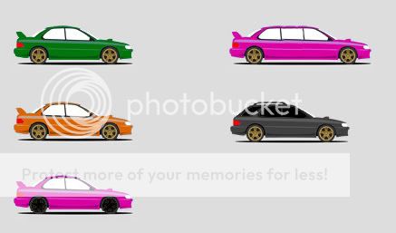
If avatars are here to stay, then why dont you give everyone the basic settings and shapes like you have done so far and then allow those relevant members (full, plus etc) to adapt their own avatars within certain guidelines.
Then they can upload them for vetting before being used in the side bar, a bit like 'view my scooby'
That way the admin team dont need to add on thousands of different varients (and god knows there are, as we are all individual ) and we get the avatar that looks like our cars without allowing all sorts of rubbish designs.
If avatars are here to stay, then why dont you give everyone the basic settings and shapes like you have done so far and then allow those relevant members (full, plus etc) to adapt their own avatars within certain guidelines.
Then they can upload them for vetting before being used in the side bar, a bit like 'view my scooby'
That way the admin team dont need to add on thousands of different varients (and god knows there are, as we are all individual
) and we get the avatar that looks like our cars without allowing all sorts of rubbish designs.
Thread Starter
Orange Club
Joined: Oct 1998
Posts: 13,763
Likes: 1
we'll considering this swiss, but it would take considerable time to vet all of the versions being uploaded, and quite a bit more software cost.
Lets take things one step at a time for now, but good suggestion.
Lets take things one step at a time for now, but good suggestion.


Probably not the right thread but with the new layout I get the following displayed - looks like the allign left feature works for the heading but not the body of the thread.

Richard.
Richard.
Last edited by Scotsman; Jul 25, 2007 at 08:11 AM.